
Δείτε τον διαδραστικό χάρτη με την εξάπλωση του Κορωνοϊού
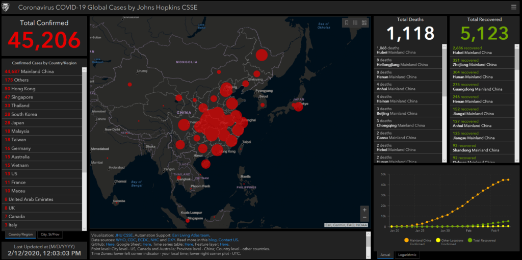
You can see the number of deaths and cases attributed to the 2019-nCoV outbreak on this interactive map by Johns Hopkins Center for Systems Science and Engineering (CSSE). Click here for mobile users.
Δεν υπάρχουν σχόλια:
Δημοσίευση σχολίου